
Project
Colour Token Revamp
Timeline
6 weeks
Tools
Figma, Figjam, Google Suite
Empowering designers through an intuitive colour library experience, to create a consistent and trustworthy end-user experience.

Discovery: Tapping into Our Resources
The Problem
Designers often do not understand what many colours mean or how to apply them. Designers end up costing the company time, risking accessibility issues, creating inconsistent experiences, and lack confidence in their choices, which trickles down to a confusing end-experience.
Our Goal
As a designer team within Geotab, we must deliver a clear, usable, and trustworthy colour library. Give designers a source of truth for colours with clear names, groupings, and guidance so they can make the right decisions quickly and with confidence.
Success Metrics
Decrease time to select colour tokens
Reduce in one-off colours
Increase designer confidence score
Increase adoption across platforms (% of pages using new colour system)
My Market Analysis

What We Were Looking For
Clear and thorough definitions
Examples of effective visuals documentation
Accessibility considerations
Approaches to background colour taxonomies
Our User Interview Plan
Strategy
Interview a primary user group: feature designers, with varying levels of experience and expertise in the current design system. This ensures a diverse range of opinions without exhausting our time and resources.
Participants
Experience Pillar A, 2 Months
Experience Pillar B, 3+ Years
Experience Pillar C, 8+ Months
Experience Pillar D, 8+ Months
Method
Set questions on workflow, usage and walkthrough
Pain points/opportunities
Quantitative and qualitative results to inform next steps
Definition: Analysis and Synthesis
Interview Findings


Our Colour Library is Lacking…
More groups within colours
Refined naming/descriptions
A11y documentation details
Colour pairings
Best practices
User Stories
As an end-user…
I need a consistent and intuitive way to read the colours on MyG and MyA
As a designer…
I need a single source of truth for all my colour library questions and concerns
I need a way to view the colour library variables and their purpose at a glance
I need thorough guidance on how to apply colours in data visualization within documentation
Development: Validation and Refinement
Improvements from Original to V1 Backgrounds
Original
V1
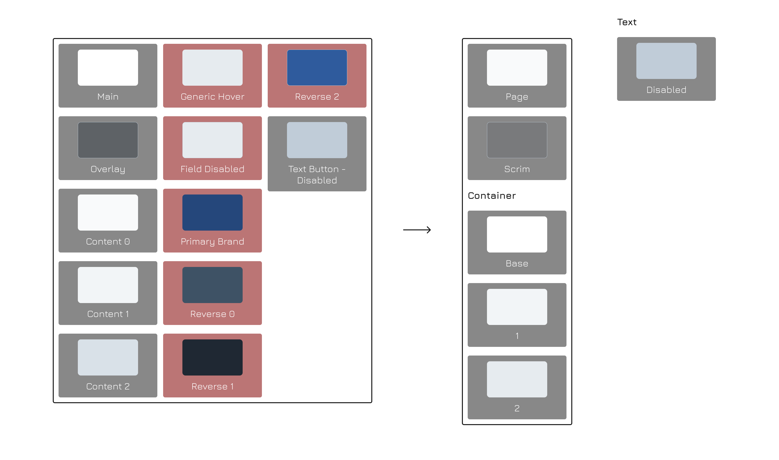
The Key Changes
Removal of legacy colour tokens
Brief names and restructuring of colour groupings
Taking after other design systems approach of layering
Validation Testing
Methods
A/B usability test — Group A using older library, Group B using new library
Card sorting exercise — Test which colour groupings and naming conventions work
Learning Objectives
Find the taxonomy that fits users’ mental models
Validate clear, predictable naming conventions
Test intuitive colour groupings
Measure impact on workflow efficiency and confidence
Evaluate overall system effectiveness
Hypothesis
Long-tenured designers will struggle more with adopting a new colour naming system
Designers are more likely to use accessible colour pairs if grouped separately in the library
Designers will avoid function-plus-number naming (e.g., action-colour-01) due to compliance concerns
My Card Sorting Template

Delivery: Garnishing and Documenting
Improvements from V1 to V2 Backgrounds

The Key Changes
More systematic thinking around the names
Less ambiguity, more direction in naming convention
Refining the design systems approach of layering
Delivery: Garnishing and Documenting
Some of My Shining Documentation Moments

Displayed clear examples of a data visualization colour rule being applied

Provided clear definitions with visual examples of when to apply said definitions
OUTCOMES + INSIGHTS



Through this experience, I learned about the layered complexities of creating something as essential as a colour library. The linked primitive and semantic tokens keep designers compliant to the design system, providing a solid end-user experience.
Our rigorous user testing concluded that we were able to achieve our success metrics for the project to:
Decrease time to select colour tokens
Increase designer confidence
Reduce one-off colours
Increase adoption across platforms (% of pages using new colour system)