
Project
Improving onboarding flow
Timeline
4 weeks
Tools
Figma, Figjam, Canva
Product Designer for social media app, focusing on expanding web experience
Discovery
Problem
Users currently have a confusing posting process which deters users from posting and engaging meaningfully with the app.
Goal
Ensure the media and text post process are similar, and posting on the Goodself web app uses task segmentation supported by progressive disclosure principles.
Industry Example
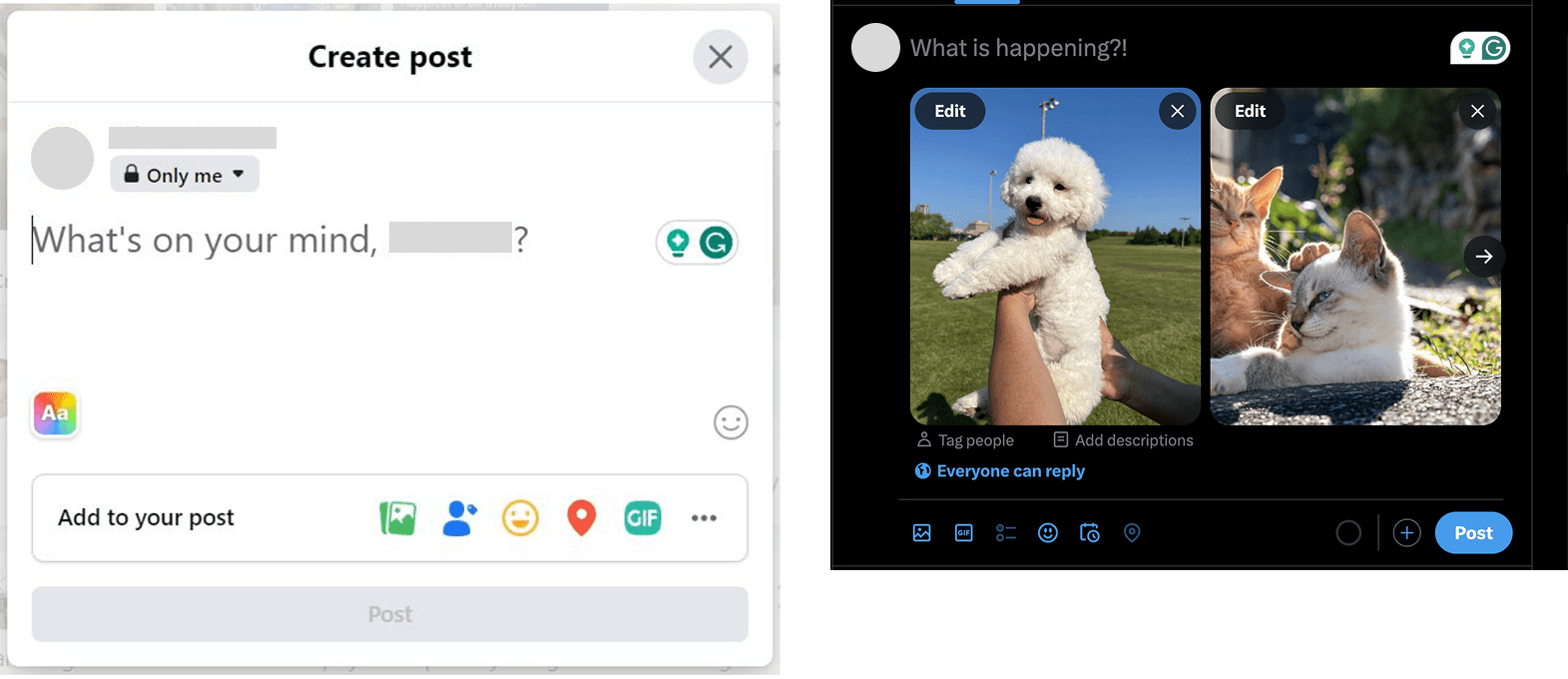
The flow seamlessly blends into one output (the post preview)
The end-user is able to customize the content at any point in the flow
Consistent icons and buttons deliver a clear visual language to the end-user
Definition
Improvements Needed
Chunking of information in sign up flow
Error states and edge cases
Optimize onboarding for desktop and tablet breakpoints
User Stories

Development
Learning Objectives
Find the taxonomy that fits users’ mental models
Validate clear, predictable naming conventions
Test intuitive colour groupings
Measure impact on workflow efficiency and confidence
Evaluate overall system effectiveness
Hypothesis
Long-tenured designers will struggle more with adopting a new colour naming system.
Designers are more likely to use accessible colour pairs if grouped separately in the library.
Designers will avoid function-plus-number naming (e.g., action-colour-01) due to compliance concerns.
V1 vs. New Upload Flow


Issues
Unclear start point
Unaccounted for inability to customize integration with third-party software
Division between text posts and media posts
Unclear development standards
Improvements
Inclusion of start point
Inclusion of third-party photo editor as part of flow
Integration of text post experience
Understanding of technical limitations
Delivery
Save to Draft Flow

Limitations around development led to a compromise in design choices
Founder and CEO pushed for "Add More" drawer feature
Stakeholder interviews revealed that users had a more fixed mental model of the app
OUTCOMES + INSIGHTS
The opportunity to streamline an existing experience was exciting and enlightening. I learned of the compromising nature of being a designer for a startup team. There were many technical constraints I needed to work around, but I benefitted from advocating for the user and overall design.